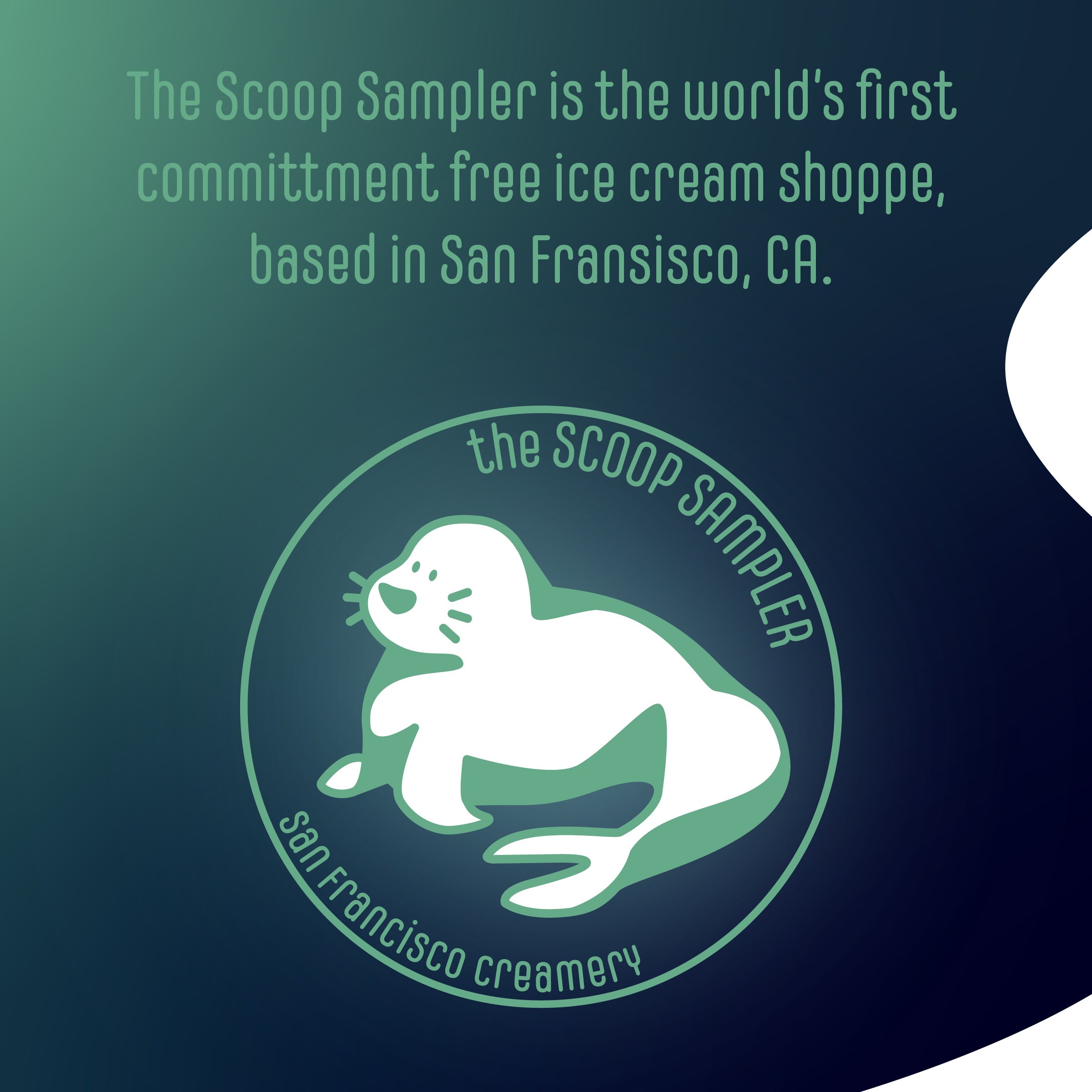
Get ready for a sugar rush with The Scoop Sampler. An ice cream shop in San Francisco where you can sample every premium flavor, I’ve mixed bold colors, playful typography, and fun patterns to create a design as sweet as the treats. It’s all about that feeling of endless possibilities—why pick one flavor when you can have them all?
The design is a visual flavor explosion that make you feel like you’re already digging into your favorite cone. I strived to create a brand identity that captures the joy of ice cream—and maybe makes you crave a scoop (or five).
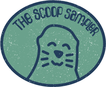
The first rendition of The Scoop Sampler was one of the first experimental projects I was able to do. I played around with texture, typography and layout. This simple logo project opened the floodgates for my experimentation with social media carousels and packaging design.


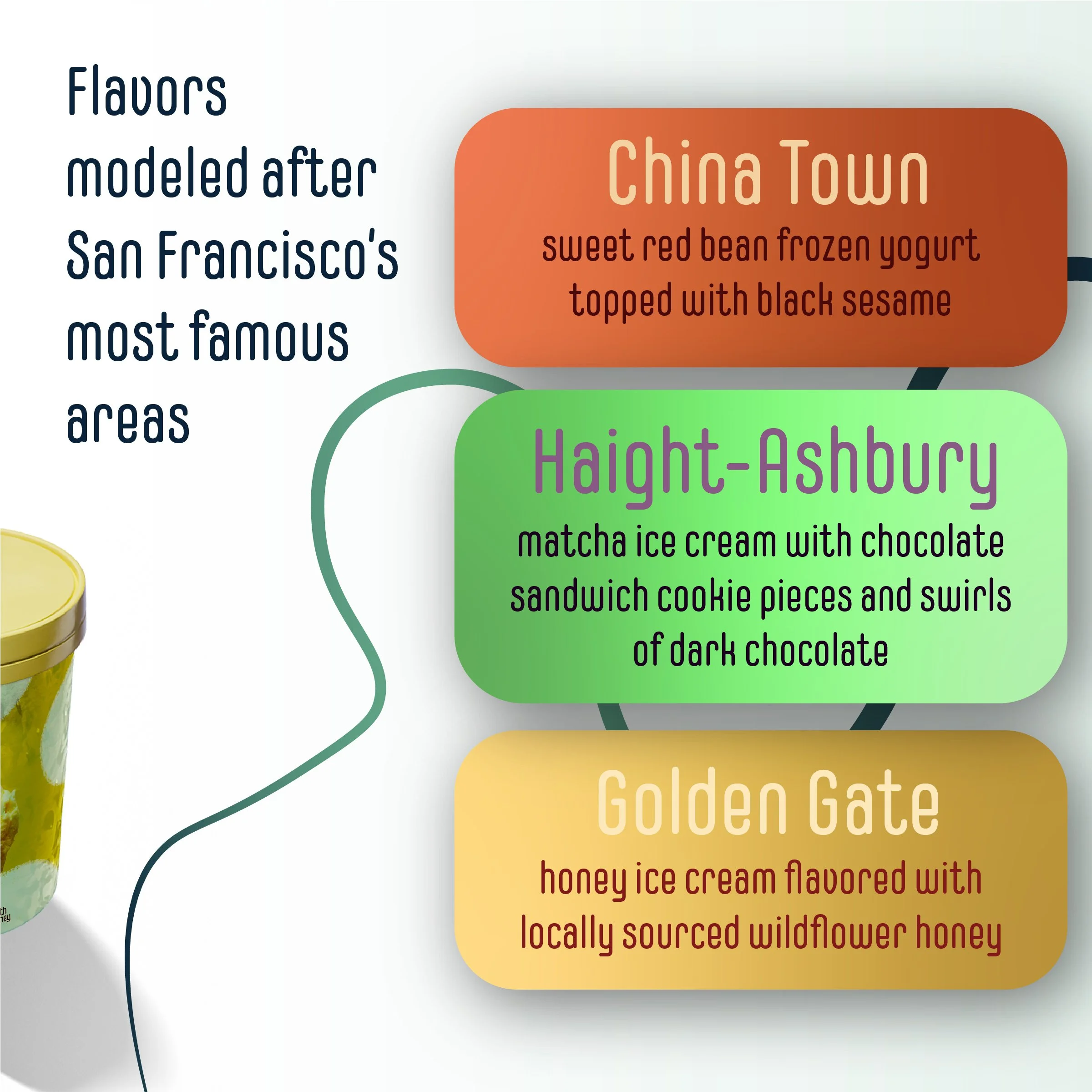
For the second rendition of The Scoop Sampler, I revamped the logo and created a Behance carousel that contained the pitch for the storefront as well as packaging for three example flavors. I wanted to focus on highlighting the individuality of each of the flavors to stand out from existing ice cream companies.


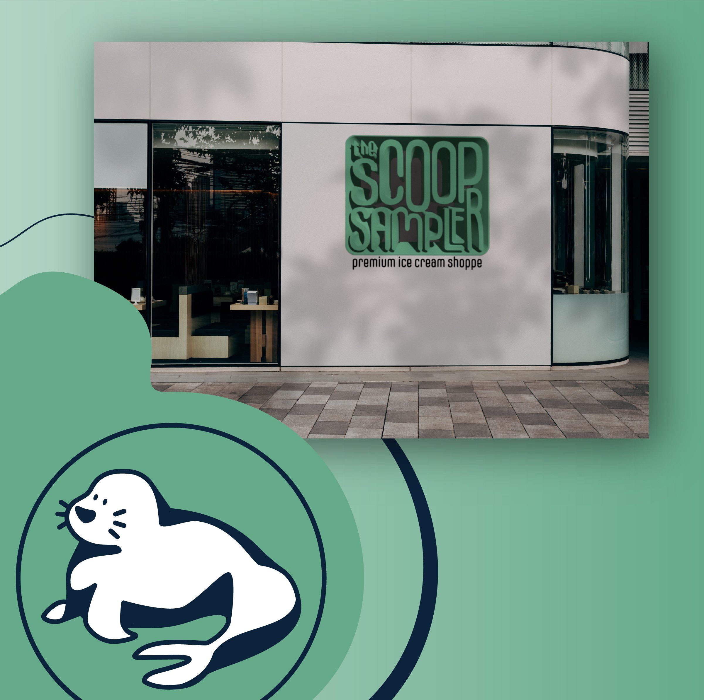
For the third and final rendition of The Scoop Sampler, I revamped the logo (again) and created an Instagram carousel. This was was my first time creating a horizontal carousel so I played around with different elements to help the directional flow between photos.