My time at The Sunflower
I had the privilege of serving in various editorial roles for The Sunflower, Wichita State University’s student-run newspaper. I gained the most design experience as design director during the fall of 2024. I was focused with designing the front and back pages (usually more) and overseeing the design of the entire issues. I gained experience in layout, editorial illustration, data visualization, sports graphics, social media design, advertisement design and more.

My last issue of the fall semester, we featured a story about the moving of the anthropology building on campus. Hundreds of artifacts would have to be meticulously moved, artifacts which I honored with fun illustrations on the margins. Each drawing is captioned with information on the specific artifacts found in the building. Researching the various artifacts and finding a way to effectively illustrate these historically important pieces was one of my favorite parts of this process.

Dr. James Rhatigan, "pillar" and "advocate" of the Wichita State community, passed away right before this issue came out. While the writing staff rushed to cover his death appropriately, I brainstormed ideas for the cover and decided to incorporate my own handwriting to illustrate the impact Dr. Rhatigan had on individual Shockers.

When the Wichita State University President Rick Muma was faced with academic misconduct allegations in his dissertation. I wanted to highlight the conflicting opinions and details of the issue with simple, limited coloring and imagery. This was one of my favorite designs of the semester.

For the 2024 basketball guide, I followed the style I had set with the previous fall sports guide: a focus on a single strong, dominant photo with high action and emotion. I used clean, fine lines and text to stand out and emphasize the geometry of the photo.
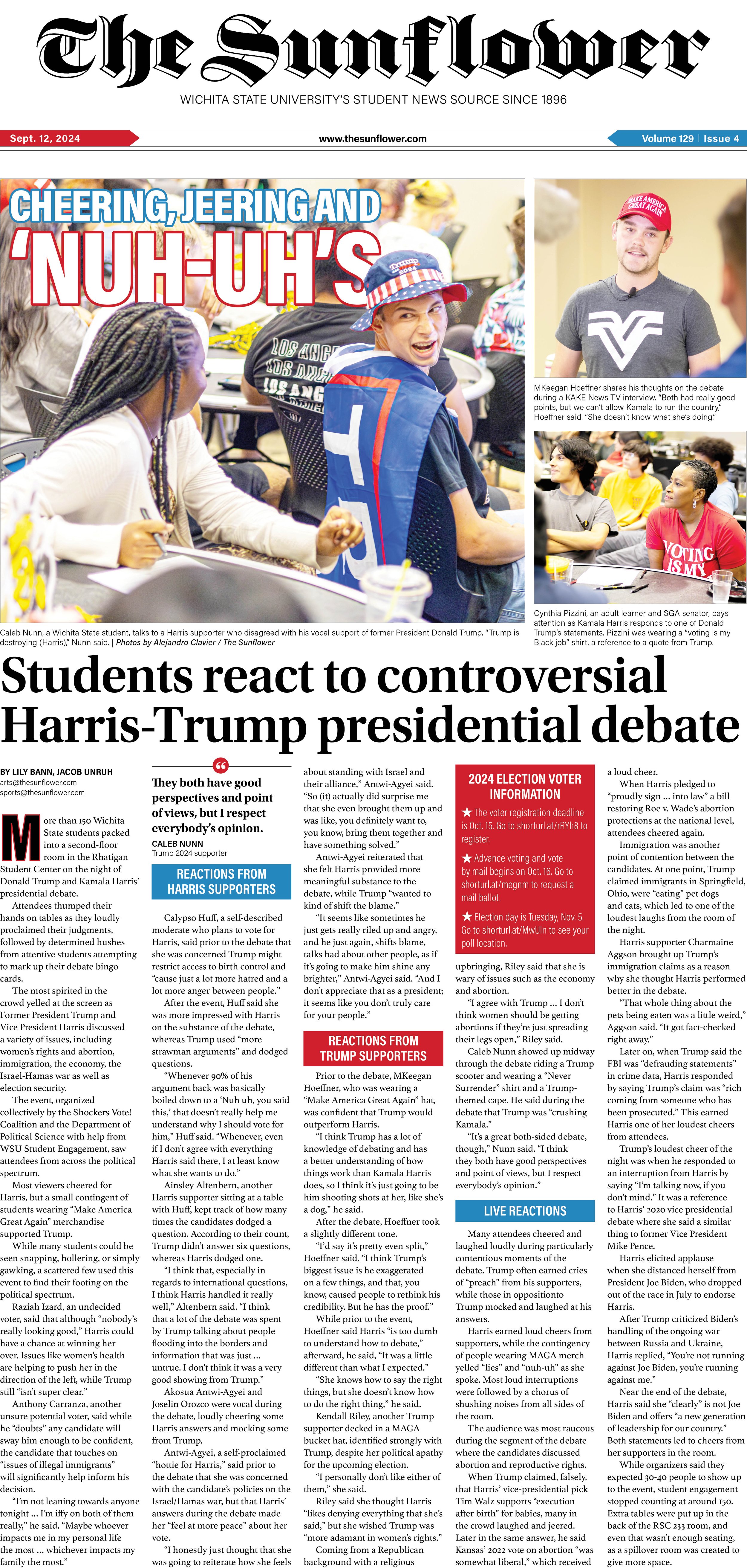
As a precursor to election season, The Sunflower covered a presidential debate and gathered student voices and opinions. I experimented with an Americana color palette and symbolism paired with wonderfully bold and expressive photography.
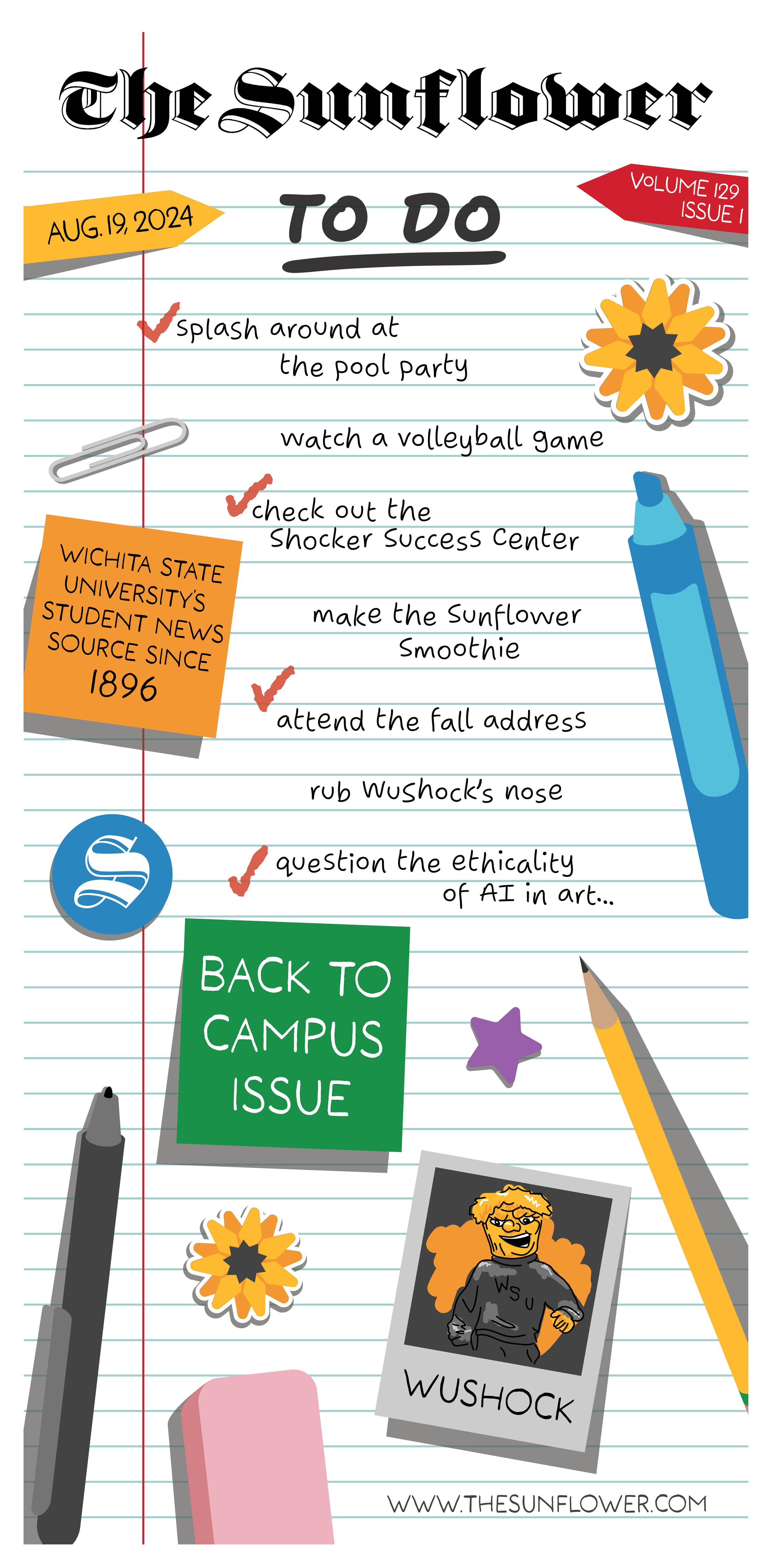
For the first issue of the year, I experimented with imagery that represents the school year: sticky notes, pens, erasers, pencils, markers, and endless checklists. Each check represents events covered in the issue, with the unchecked items representing upcoming events. The stickers and pens appeared throughout the pages of the issue for consistency.
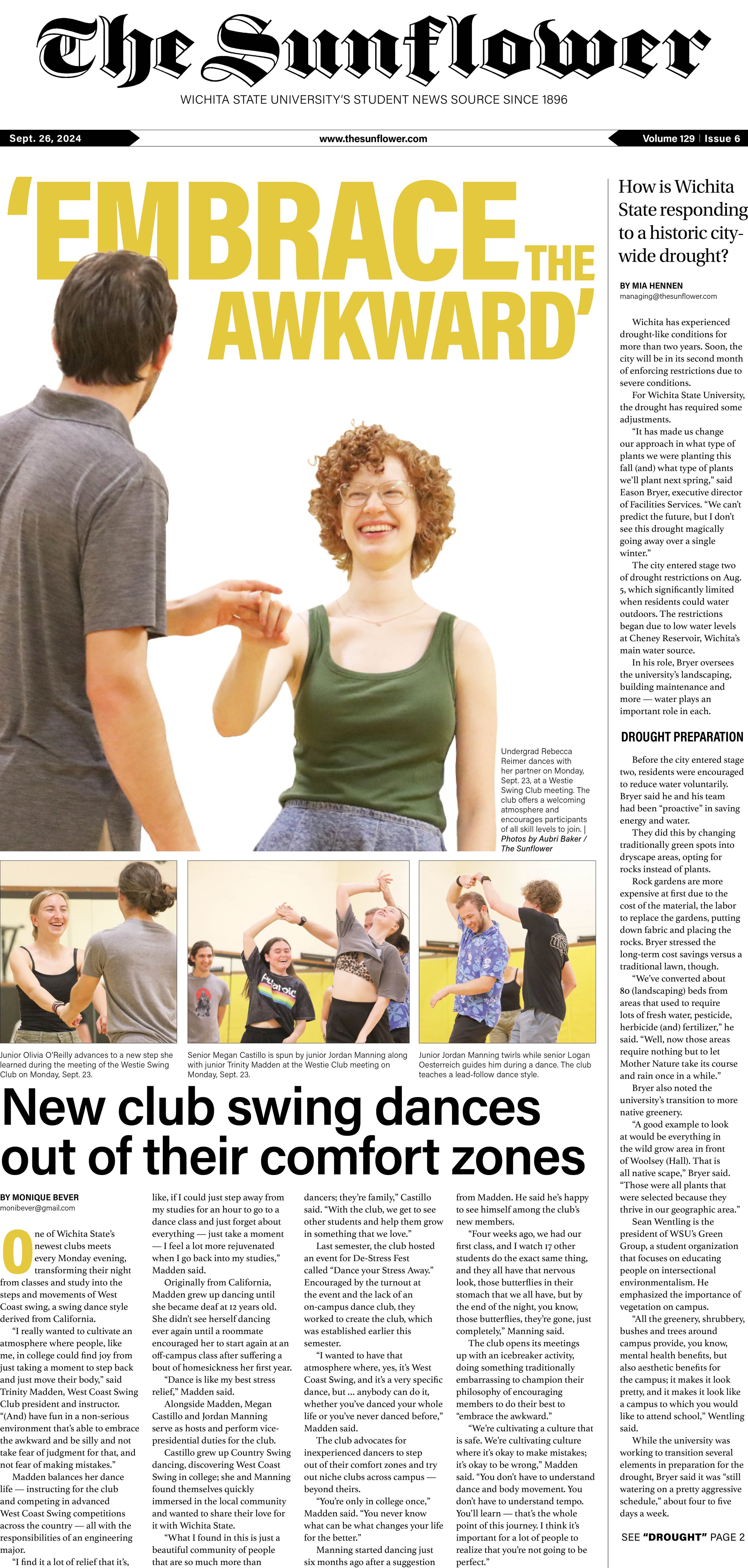
For this issue, I took my time in cutting out the main figures for a dominant photo. Overlaying photo and text is one of my favorite motifs for front page editorial designs.
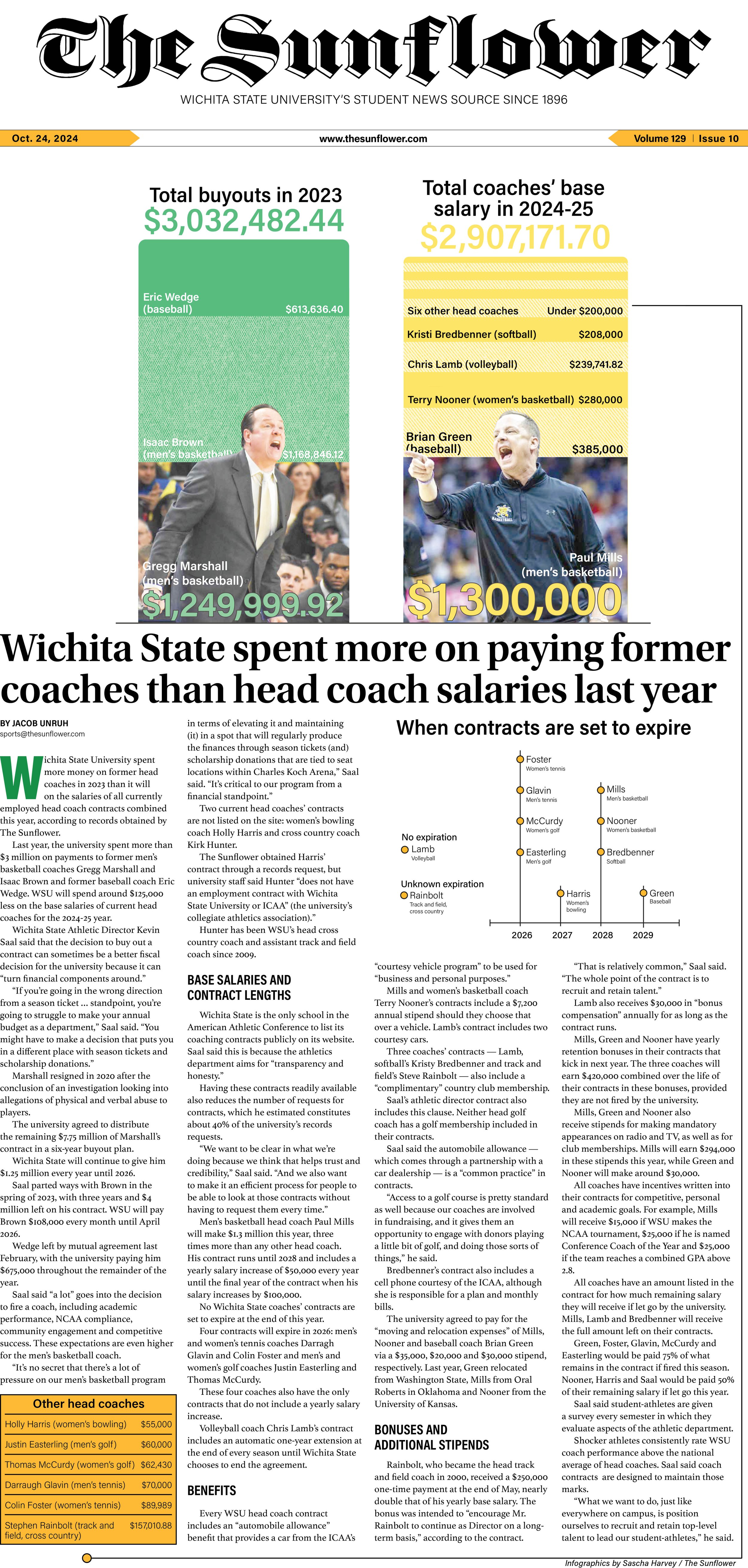
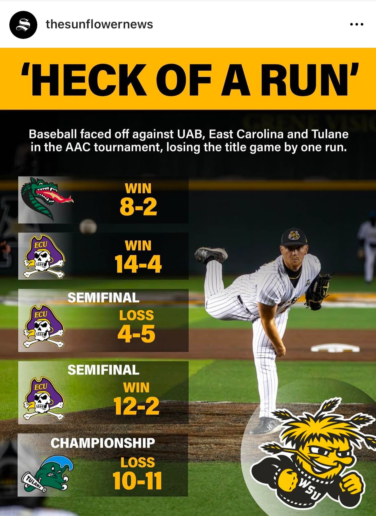
After hours (literal hours), myself and the sports team had collaborated to create a graphic we were all happy with for the front page. They express their ideas to me and the importance of each element while I worked to find a way to achieve this visually.
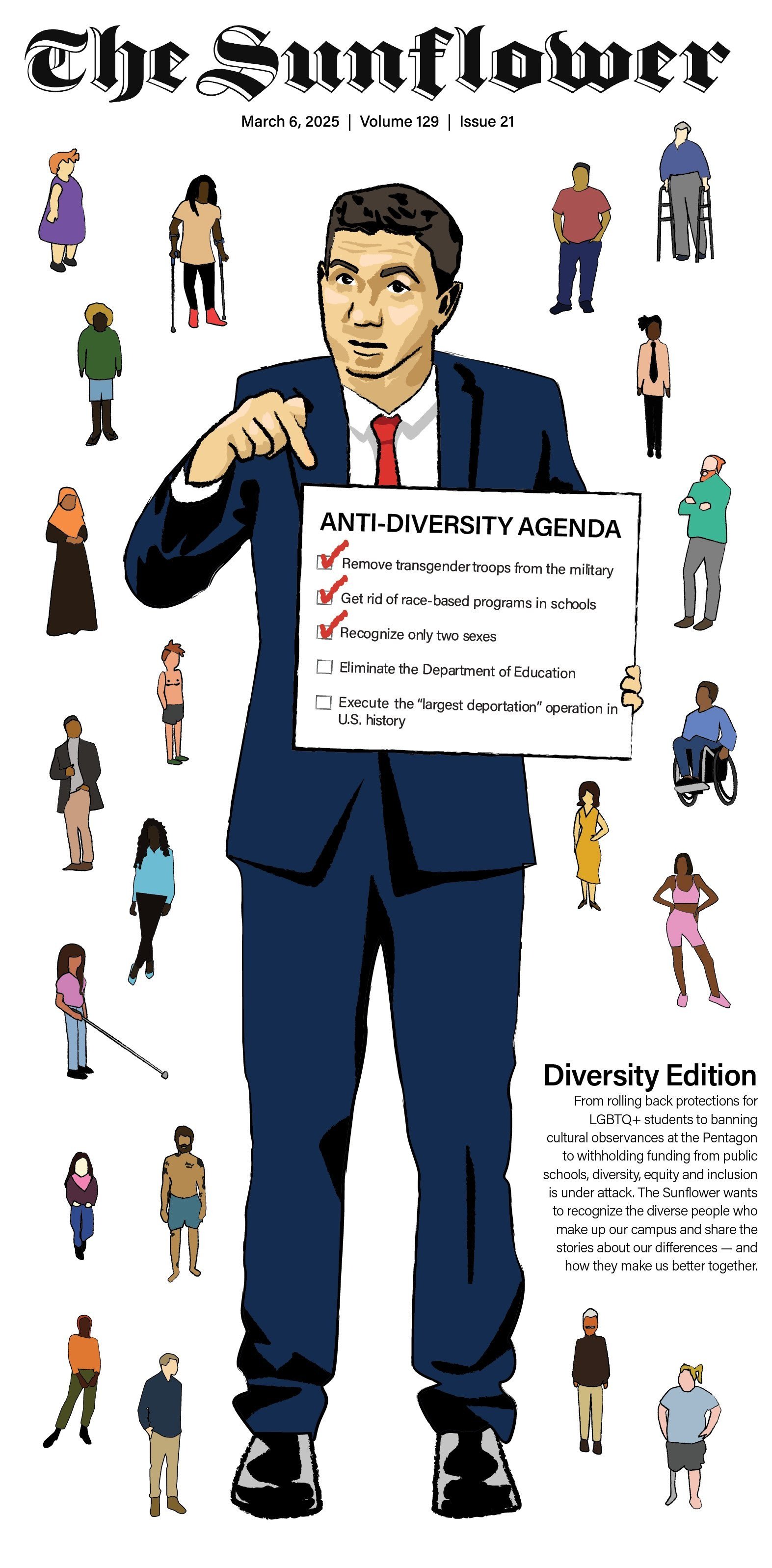
For The Sunflower's 2025 diversity edition, we wanted to highlight individual uniqueness and the beauty of diversity while our differences are under scrutiny due to various political movements in recent months. For the characters, I tackled various body types and shapes, skin colors, hair textures, abilities, and personal dress. The large figure holding the sign represents politicians as a whole and the attacks diversity, specifically diversity, equity and inclusion initiatives (DEI), has faced.

For the transition to the women's basketball guide, I found another photo with high levels of anticipation and action. This segued into the energetic features and photos in the guide.

Bill! Bill! Bill! When science legend Bill Nye came to speak at Wichita State, of course we had to feature him on the front cover. I wanted to play up the nostalgia from the theme song we all know and love.
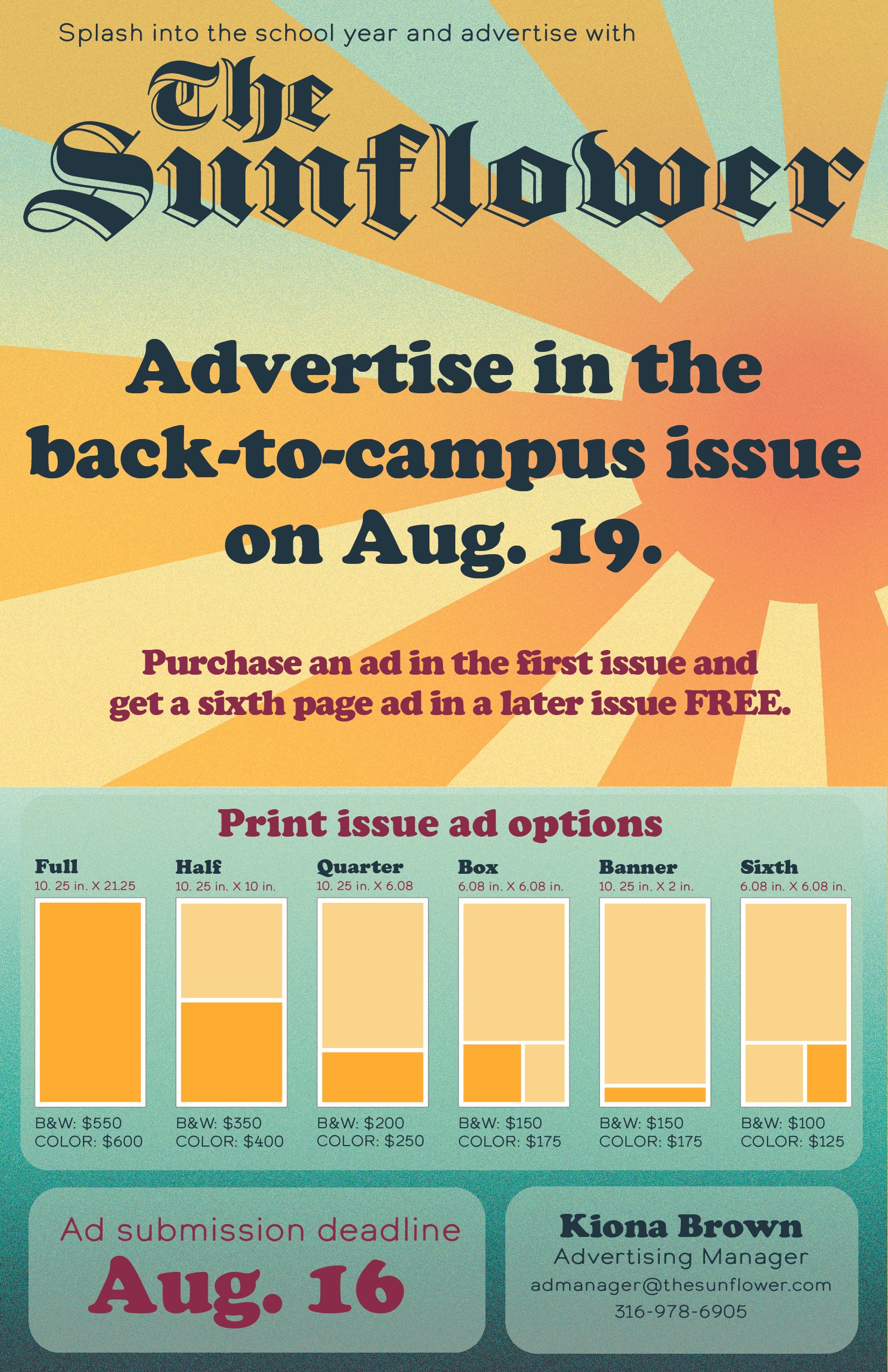
For this flyer, the goal was to tie in summer themes with the back-to-campus issue to sell ads. I went for an 80s summer camp theme with contrasting bright yellows and oranges, a deep maroon and muted blues.
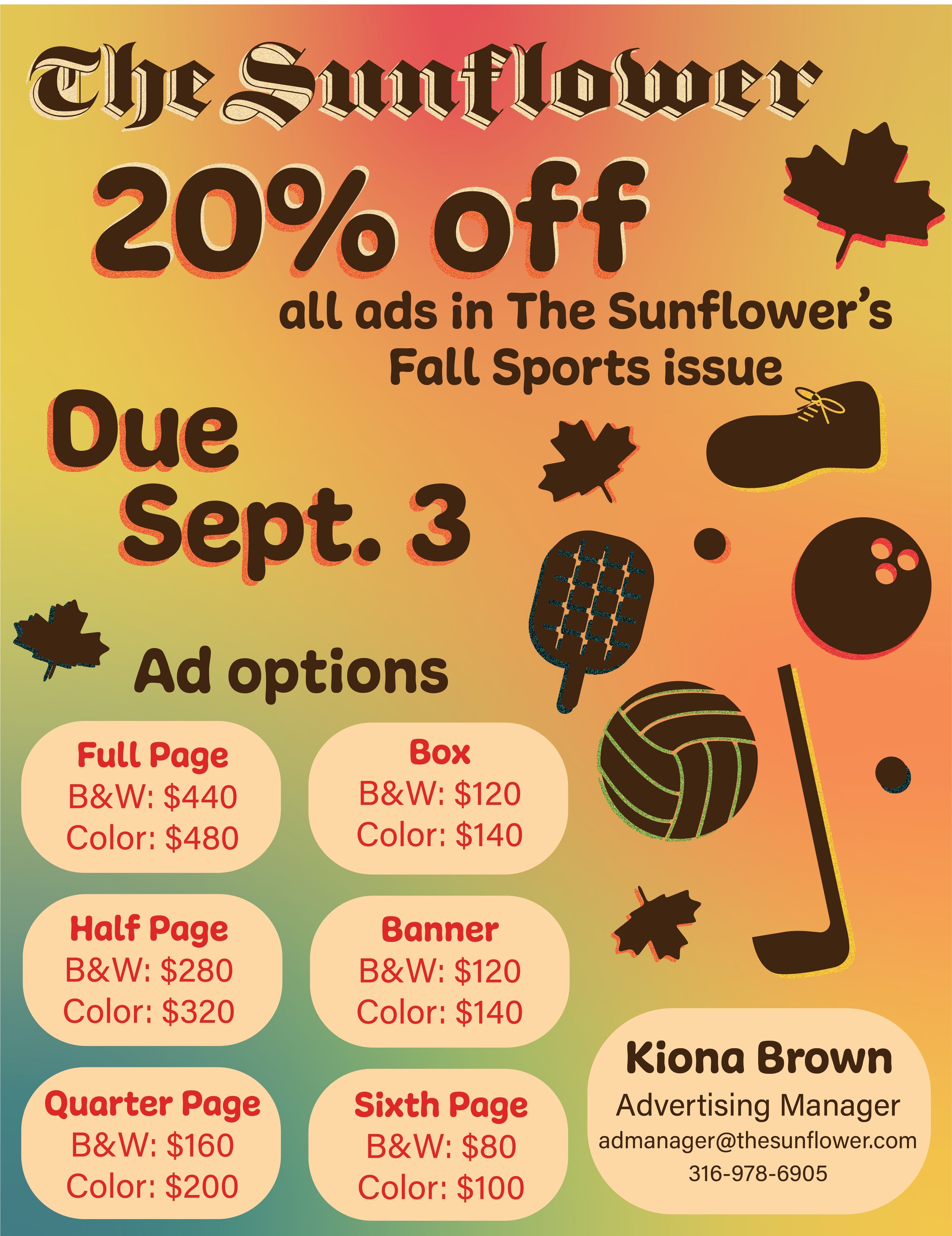
We wanted to highlight the upcoming fall sports issue in this flyer. I used more autumnal colors that were still eye-catching and paired them with icons of the various sports that would be covered in the issue.
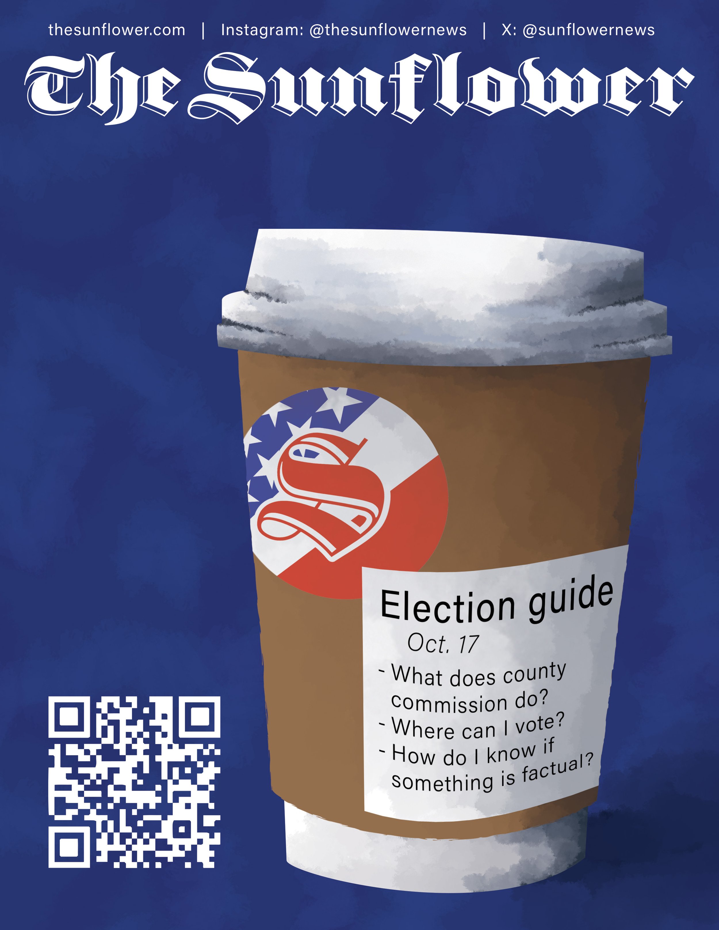
The simplicity of a coffee cup was meant to draw viewers in for The Sunflower's election guide, with covered topics taking place of order modifications.

This poster utilizes classic New Year's Eve themes and imagery with a fresh, rich color palette.
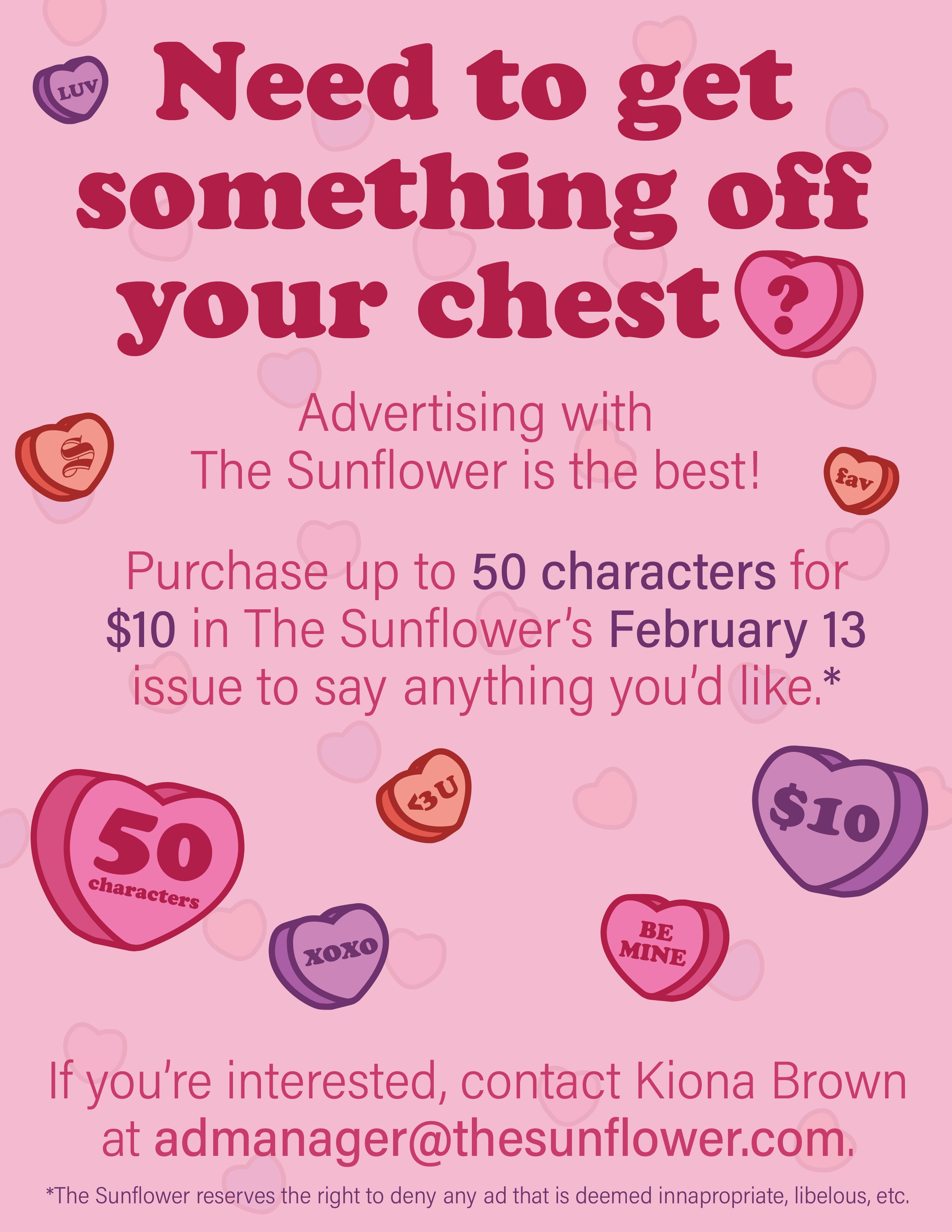
Combining a cute rhyming scheme with conversation hearts? Nothing says "Valentine's Day" more than that. I used previous font pairings for this flyer.
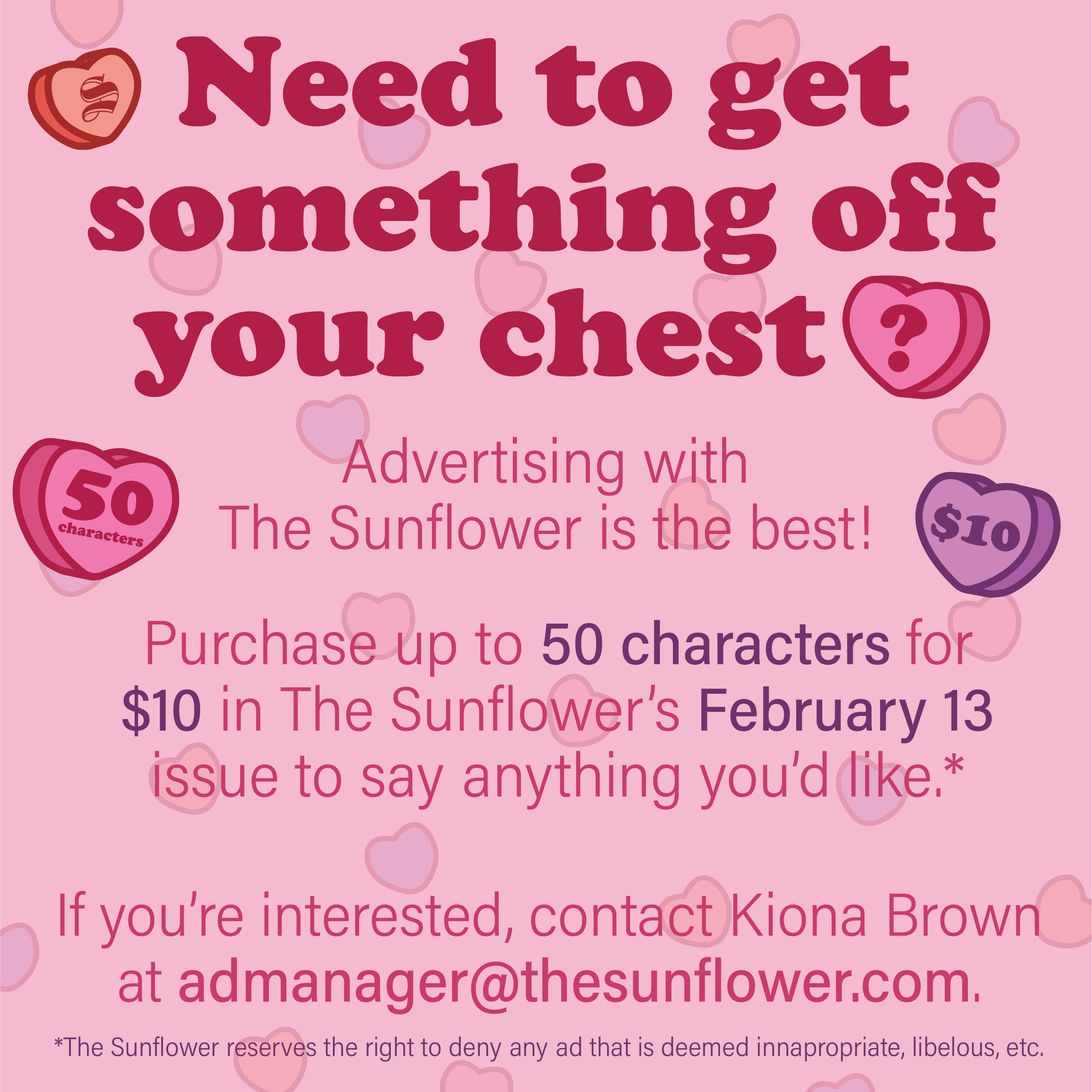
I re-formatted the previous flyer as an Instagram post to capture more audiences, using the same copy and general composition.